16. February 2025
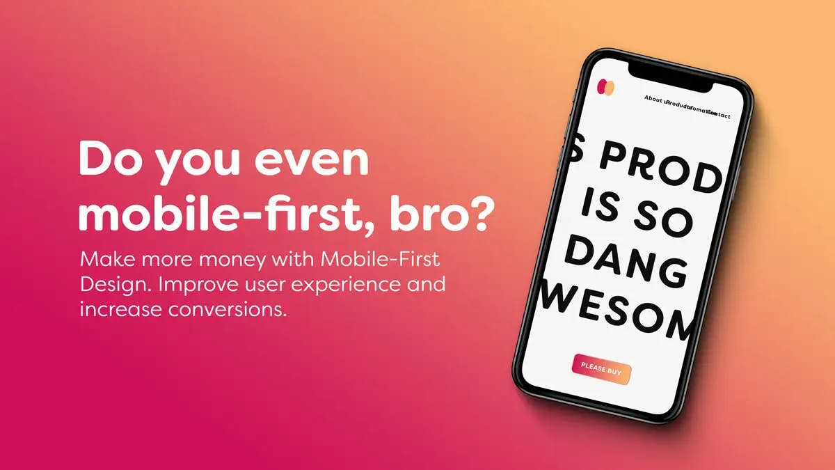
It’s no secret that mobile-first design has become the new norm for businesses of all sizes. With more people accessing the internet from their smartphones than ever before, it’s essential to make sure your website looks great on mobile devices. But what does it really mean to be mobile-first? And how can small businesses unlock the power of mobile-first design to give customers a better experience?
The goal is to create a website that looks and functions great no matter which device it is accessed from. By designing for mobile devices first, websites can be more responsive, faster, and easier to navigate, providing a more seamless user experience across all devices.
More traffic is coming from mobile devices
Mobile device usage is projected to continue to grow in 2023, with nearly 50% of global web traffic coming from mobile devices. This is expected to remain steady in the coming years, with the data suggesting that mobile devices are becoming increasingly popular for web browsing. Additionally, the statistics show that mobile users are more likely to use social media than desktop users, and they spend more time on websites. As a result, it is important for web developers to design websites that are optimized for mobile devices.
This means that if the experience of your website is lacking on mobile devices you could potentially be missing out on huge profits.
Reference: Desktop vs Mobile vs Tablet Market Share Europe | Statcounter Global Stats
Mobile-first design principal examples
Practical examples of mobile-first design can be seen in modern websites such as Google, Apple, and Twitter. Google uses a mobile-first design to ensure that all of their webpages are optimized for mobile devices. Apple's website uses a mobile-first design to ensure that their pages are easy to navigate on all devices. Twitter has also adopted a mobile-first design to provide users with an optimal experience regardless of where they access the website from. Additionally, many businesses have adopted mobile-first design principles to ensure that their websites are easy to use and navigate on all devices.
You should consider how it affects SEO
Mobile devices have smaller screens and slower internet speeds, so a website that is designed for mobile devices will be faster and easier to navigate. Additionally, Google has started to prioritize mobile-first websites in their search algorithm, meaning that websites that are optimized for mobile devices will have a better chance of ranking higher in search results.
Ultimately, mobile-first design principles are important for SEO because they enable websites to be more user-friendly and optimized for mobile devices, resulting in better rankings in search engine results.
Also, think about the end-to-end experience
Optimizing a website for mobile devices is not just about the design, it's about enhancing the entire user journey. For example, if you own an e-commerce site and your checkout page only offers card payments, you could be missing out on opportunities to make the checkout process more seamless and faster for your users.
By adding support for mobile payment services like Apple Pay , Google Pay and MobilePay for Danish users, you can improve the overall mobile experience for your customers and potentially increase conversions. So, when thinking about responsive web design, it's important to consider the entire user journey, not just the aesthetics of the site on different devices.
Now for some code stuff 🤓
- Set the width of an element to be a percentage of the viewport width:
@media (max-width: 600px) {
.element {
width: 80%;
}
} - Hide an element on small screens and show it on larger screens:
@media (min-width: 601px) {
.element {
display: block;
}
}@media (max-width: 600px) {
.element {
display: none;
}
} - Change the font size of an element based on the viewport width:
@media (max-width: 600px) {
.element {
font-size: 16px;
}
}@media (min-width: 601px) and (max-width: 900px) {
.element {
font-size: 18px;
}
}@media (min-width: 901px) {
.element {
font-size: 20px;
}
} - Use a grid layout for the page content on larger screens, and a single-column layout on smaller screens:
@media (min-width: 601px) {
.page-content {
display: grid;
grid-template-columns: repeat(3, 1fr);
}
}

@media (max-width: 600px) {
.page-content {
display: block;
}
}

